Wednesday, May 11, 2011

Richardson's regression...and reinvention

Photo by Tim Engleman (CC BY-SA 2.0).
The Richardsonian Romanesque style of the Newton Corner Worship Center, originally Immanuel Baptist Church (1886), in Newton Corner, Massachusetts, was unmistakable from the moment I first noticed it from the bus window. All of its features were straight out of Henry Hobson Richardson's much-emulated pattern-book: random ashlar rock-faced walls, thick-arched windows and doorway, stocky columns, pointed but squat lantern tower, cruciform configuration, and heavyset massing that stresses structural solidity and earthen solidarity. Yet it never crossed my mind that this was a work of the Master himself, due to its scarce mention in books on him, due in turn to its simplified and clunkily proportioned design.
An apparent reworking of a proposal for Pittsburgh's Emmanuel Episcopal Church (1886) rejected for its $25,000 price tag in favor of a simpler $12,000 job, Immanuel Baptist shows its share of cost-cutting, hence corner-cutting (as a recycled design built in brownstone to save money), that renders it less complete and coherent than its Pittsburgh predecessor (right).
Though it may suggest a fire station with its triumvirate of large front arches and red-brick uniformity, Emmanuel Episcopal is more unified as one composition. Its apse gently semicircles around the rear, carrying the peaked roof with it in a conical fashion. At the front the roof forms a spire-like gable, with a slot window and stone finial emphasizing its heavenward verticality.

By contrast, Immanuel Baptist pops out all over the place, as if assembled from a kit of parts derived from a patchwork of patterns. The "witch's hat" spire thrusts up pompously from the lantern's crowning pyramid. The tapered structure below the lantern is too self-expressive, making the adjoining stone mere filler. The west front's unfinished stonework protrudes as if pining for carving. Its central window dwarfs the window-pairs with over-authority. 
The transept wings frame their window trinities agreeably but lack side-wall definition. 
Photo by Tim Engleman (CC BY-SA 2.0).
In fact, the nave and transept's side walls form a prison-like presence as they cross, which is more foreboding than inviting—or should I say more purgatorial than ecclesiastical, as if making a pact with the witchy tower.
 
Photo by Tim Engleman (CC BY-SA 2.0).
The side entrance adds to the bulk, interrupting the continuity of the transept-to-apse transition with a wart-like protrusion. It clearly expresses its function as a circular stair-shelter, but in a way that knocks the building's symmetry lopsided and, with its oblong shape, lacks the grace of the cylindrical turret that enriched many of Richardson's buildings. Yet its conical roof is somewhat redemptive, and it is hidden from view on the church's main street, preserving the symmetry from there.
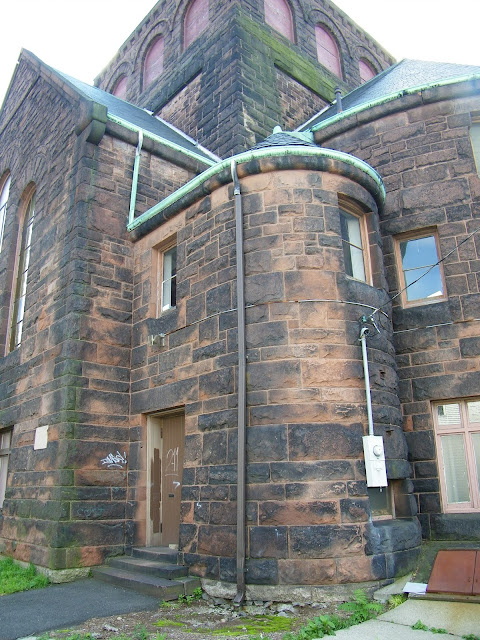
 
Photo by Tim Engleman (CC BY-SA 2.0).
The apse has no clear exterior expression, being a hierarchy of diverse window carousels that lend few clues about what goes on inside. The chimney jarringly transitions from brick to stone (unless the brick part is a reconstruction) and sticks out like a smokestack, further reminding us of the cohesion the church lacks. 
 
In short, the church doesn't seem to know whether to grow up or out. Richardson's work as a whole is marked by an earth-bound attachment to the ground, occasionally contrasted with a sky-borne tower. But Immanuel Baptist is just as vertical as horizontal, as if the forward-thrusting, steeply gabled nave is competing with the tower and transept 
for street prominence rather than working in concert with them to form a Holy Trinity. Also, the walls are more fortress-like than church-like—an agreeable nod to Martin Luther's hymn "A Mighty Fortress Is Our God," but one that lacks the exuberance of...
Trinity Church, Detroit Photographic Company, c.1897-1924, courtesy
of the Beinecke Rare Book & Manuscript Library, Yale University.
...Trinity Church in Boston (1872-77), Henry Hobson Richardson's masterwork of masonry majesty, where quarried, striped, checkered and carved stonework and statuary augment the articulation of each individual part in a way that logically cohere the parts together into one massive whole that celebrates God's works on earth in form, finials and fine art. Even the stair steps lively, being cloistered, not closed.
Immanuel Baptist's main entrance is its fullest realization of the Richardsonian Romanesque ideal (despite the uncarved column capitals and the 2011 removal of the original oak doors for replicas) for its stone sunburst of concentric semicircles, the lower one recessed to guide you inside, offering you a radiant invitation...
...into a surprisingly well-kept sanctuary with a swooping proscenium arch, vaulting hammer-beam trusses and a Roman-arched altarpiece that all appear to fall mathematically in line with the entrance as its axially logical destiny and open welcome to all. What's more, this boldly theatrical gesture acts as the symbolic genesis of...
...diverse congregations of Arabic, Brazilian, Filipino, Greek and Russian Jewish origin, as the home of the Arabic Baptist Church, the New England Brazilian Baptist Church, the Philippine International Church, the Hellenic Gospel Church, and the Beth Yeshua Messianic Congregation. According to Rachel Lebeaux of The Watertown TAB, this interfaith tradition began when a Greek fellowship acquired the church, by then known as the Newton Corner Baptist Church, for $1 in 1990 and renamed it the Newton Hellenic Gospel Church, agreeing to open it to parishioners of other faiths lacking home places of worship. Rechristened the Newton Corner Worship Center in 2007, it is a gathering place for faiths of all forms, each congregation holding a service on a different day but many of them coming together at Christmas and Easter. 
This image from Lebeaux's article shows not only how well a diversity of congregants from a broad spectrum of faiths bond with each other in this universally sacred space, but how well the congregations have cooperated to preserve the 
artistic stained-glass windows, a hallmark of a Richardson church, simple or sublime. 

Which means I ought to cut the Newton Corner Worship Center some slack, even though it isn't considered exemplary of Richardson. After all, he was serving a congregation not as deep-pocketed as Trinity's, with a budget that reduced the architecture to the bare-boned basics of nave, transept, apse, tower, stairwell and chimney. Also, as these archival images show, Immanuel Baptist Church did have more distinction in its heyday, thanks in part to ivy, which will raise any masonry edifice to a high academic level. Perhaps this rejected church proposal might have been better reinvented for a university. Yet its interfaith reincarnation has given its simple towered cruciform design a universality that people of many faiths can relate to, whether from Brazil, Greece, the Philippines, Russia, Saudi Arabia, or whatever corner of the Earth they came from to come to Newton Corner.

Thank you for visiting. I welcome your comments!

Little boxes on the hillside...

...but Pete Seeger and Malvina Reynolds (the song's original writer) would be wrong to say these ones are "all made out of ticky-tacky and they all look just the same." No, this time the topography defines the boxology, in proper Roxbury fashion. 

This contemporary condominium on Fisher Avenue in Boston's Roxbury neighborhood is the closest thing to a "Roxbury style" I've ever seen, taking full advantage of the area's characteristically hilly terrain to evolve as a series of stepped dwelling units leading up to a "lookout" tower room at its pinnacle. Thus each level's setback along the upward bound hill yields each unit (or story, in the uppermost unit's case) a terrace from the roof of the lower unit or the ground-level garages, which comprise the first floor so that they don't intrude upon any unit's living space with exhaust odors or car motor noise. This multilevel arrangement allows each unit a great hillside view, and each level is jogged out in a zigzag form to allow it multiple sides of exposure, hence more light inside.

This creative configuration gives the entire complex a jagged, asymmetrical form that emerges as a geometric abstraction of the randomly craggy Roxbury puddingstone that characterizes this neck of the woods. This conglomerate stone, seen here in Roxbury's preserved Rockledge Urban Wild, is an aggregate of many different kinds of rocks, stones and pebbles bonded together by prehistoric volcanic and glacial action, forming the bedrock underlying the bulk of Roxbury, as well as parts of Brighton, Brookline, Canton, Dedham, Dorchester, Dover, Jamaica Plain, Milton, Needham, Newton and Quincy.

'Of the hill'

Of course, the greatest hill-house of all is Frank Lloyd Wright's Fallingwater in Mill Run, Pennsylvania. Far from the run-of-the-mill of little boxes on the hillside, this nature-inspired masterpiece of organic architecture comprises big slabs on the cliffside, cantilevering over the waterfall below them in a visually precarious posture — albeit in a geometrically ordered programme that reflects the machine age as well as nature's way. 

Man and nature are both at odds and in détente here, and the structural assuredness of the balcony slabs is counterbalanced by the unpredictability of their built-to-last claim, appearing ready to cascade down the rocky waterfall on a moment's notice as the water gradually erodes the rock into the soil from which all came, and to which all shall (theoretically) return. 

The stair towers are built of local stacked stone as a monument to the nature that made all things and a contrast to the man-madeness of the concrete that cast the slabs. The verticality of the towers also emphasize the upward climb of the hill the house is perched on, while the thin horizontality of the stones contrast this with a reminder of the earth the house rests on, as the prime giver of its building materials. Rarely have lodgings and land been so seamlessly unified, to the degree that both are respected in our eyes as we gaze at this architectural spectacle.

Fallingwater, built in 1934 for business tycoon Edgar Kaufmann, epitomizes Wright's prescription for all houses: 
No house should ever be on a hill or on anything. It should be of the hill. Belonging to it. Hill and house should live together each the happier for the other.
— Frank Lloyd Wright, An Autobiography (1932)

On or of the hill?
 
Chestnut Street, Beacon Hill.
One wonders what Wright thought of Beacon Hill during his brief stays in Massachusetts, as a child in Weymouth and while designing his Amherst Usonian House. Though scornful of historical styles, he hopefully appreciated the way the Mount Vernon Proprietors let the hill shape a cohesive neighborhood with a rhythmic progression of brick rowhouses.

Acorn Street, Beacon Hill. Photo by Ian Howard, courtesy of Wikimedia Commons.
Beacon Hill's homes forge a visual unity that evokes the close-knit community the developers had intended, while visually referencing the hill's contours as the homes ascend and descend the slanting streets in a consistent curve, which their general uniformity of height gives rise to. Thus they are more of than on the hill, belonging to it, since the hill was the nurturing mother of their collective design, and they are not freestanding on the hill but supporting and shoring up one another's structure with abutment, like a hill's firmly packed soil and strength-bracing rock. This is especially true of Acorn Street, the way the cobblestones allude to the natural rock and soil of the hill the community grew on.

Windowboxes on Beacon Hill.
Photo by M2525, courtesy of Wiki.
Chestnut Street, c.1869.
Photo by Philip Bergen.
And the diversity of door elements, cornice heights, fenestration, and decoration—particularly windowbox flowers and yuletide wreaths—makes Beacon Hill homes not "all look just the same," expressing the individuality of the occupants in a composition that epitomizes Samuel Taylor Coleridge's definition of beauty: "unity in variety." 

Cutting Down Beacon Hill, c.1810.
This is how Beacon Hill became a prototype of hillside development. Which would not have been possible had the hill itself not been cut down from 1807-1828, for landfill to fill in the Mill Pond and to level the hill to a comfortable live-on height. This made the neighborhood even more "of the hill," as steep inclines wouldn't have made the hill or its residents "each the happier for the other."

Right, Wright?

Thank you for visiting. I welcome your comments!

Monday, May 9, 2011

The Great 'Pieramid' of Tampa

Photo by Texx Smith, courtesy of Wikimedia Commons
For Pete’s sake!

What’s that at the end of the pier?

A Key West-bound cruise ship?

A Disney theme park?

Alien spacecraft?

Expo 2011?


No, it’s The Pier itself.

Pete's Pier

Courtesy www.terraceparksuites.com/about-st.-pete.html
The St. Petersburg Pier, that is — Tampa Bay’s signature icon, a monumental gateway to (and getaway from) its namesake city. Anchoring the end of a mile-long wharf approach from downtown St. Pete, this colossal inverted pyramid combines shopping, dining, fishing, boating, an aquarium, festivals, live entertainment and much more on five floors of Florida family fun.

Sittin' on the dock of the Bay

Courtesy www.planetware.com/picture/st-petersburg-st-petersburg-pier-us-fla393.htm
 Courtesy www.tripadvisor.com/LocationPhotos-g34607-w2-St_Petersburg_Florida.html
The fun begins right on the dock, where you can take in the Tampa Bay view, go on a boatride or dolphin watch, pedal a surrey bicycle along the waterfront, take a horse-drawn carriage ride into the city, feed the pelicans, or fish for amberjack, flounder, sea bass, shark or snook with poles and bait from The Pier Bait House (right), a roof-tiled remnant of The Pier’s 1926 predecessor.

Canopy to culture and cuisine

Courtesy www.gourmetgirlmagazine.com/casualdiningspotlight.php
The Pier’s grand entrance canopy introduces a tourist information desk and 16 specialty shops selling candles, collectibles, crafts, fashions, jewelry and more. 

The Dockside Eatery food court offers a smorgasbord of fast food, including Burger Bay, Cara’s Pizza, Hong Kong, and 41 ice cream flavors at Cones on The Pier. 

Al's alcove

Courtesy inkwatu.com/2008/08/06/st-petersburg-pier/
At Captain Al's Waterfront Bar & Grill, you’ll be sittin’ on the dock of the bay enjoying all-American cuisine in your choice of indoor seating, the outdoor patio or the tikki bar area, hearing live bands on the Waterside Courtyard every weekend. 

The Dockside Activity Room holds an Oldies But Goodies Dance the second and fourth Wednesdays of every month, and hosts such local acts as the SunCoast Band.

Fish tank, fish taste

Courtesy inkwatu.com/2008/08/06/st-petersburg-pier/
Upstairs is the Pier Aquarium, where a $5 admission ($4 for students and seniors, free for children under 7) lets you gaze at a colorful collection of native and tropical fish in a 2,000-square-foot tank. 

Restaurants for all tastes comprise the pyramid’s upturned “base,” which cantilevers outward for the ultimate on-the-bay dining experience at:
  • Cha Cha Coconuts Tropical Bar & Grill, featuring Bahamian conch fritters;

  • Columbia Restaurant, where the Tampa Bay panorama complements the Spanish/Cuban fare;

  • Fresco's Waterfront Bar & Grill, serving Mediterranean cuisine in a suitable seaside setting. 


Pier's precedents

The Pier originated in 1889, when the Orange Belt Railway built the Railroad Pier on Tampa Bay, three years before St. Petersburg’s incorporation as a city. An immediate success, the Railroad Pier was replaced in 1906 with the Electric Pier, which extended 3,000 feet into the bay and dazzled tourists and locals with its theatrical night lighting. This gave way to the Municipal Pier in 1914. When the Hurricane of 1921 damaged it, the city appropriated a $1 million bond for a...

Million Dollar Pier


Inaugurated on Thanksgiving Day in 1926, this Mediterranean-style palace boasted an open-air ballroom with rooftop terrazzo floors, an observation deck, and a grand central atrium for all sorts of community events, including card games, fishing tournaments and singalongs. Its grand portico became WSUN-TV’s studios, from which “Captain Mac” broadcast his children’s show in the 1950s. Fallen into disrepair, the Million Dollar Pier was razed in 1967.


Tubular!

Courtesy inkwatu.com/2008/08/06/st-petersburg-pier/
The St. Petersburg Pier, opened to the public in January 1973, was designed by William B. Harvard Sr., founder of Harvard Jolly Architecture, with a tubular steel framework to create large windows for copious sunlight and bay views, and an inverted pyramid form to maximize the top floor area and observation deck.

Southern nights

Courtesy www.flickr.com/photos/rvs3designs/4203478639/
This offbeat design enables The Pier to continue its predecessors’ traditions of providing plentiful space for private and public functions, offering Tampa Bay’s most breathtaking observation point, letting patrons dance the night away, and electrifying the bay’s night sky and clear waters with colorful lighting and fireworks.

Thank you for visiting. I welcome your comments!