Sunday, July 11, 2021

Bath to nature

"When nature calls" is our standard summons to go use the facilities. But is nature really calling us, design-wise? What does "bathroom" bring to mind, regarding the materials we see, touch, and clean when another nature calls (mold and mildew)?

That's easy: Tile. Enamel. Iron. Steel. Chrome. Brass. Glass. Granite. Marble. Quartz. Plastics.
All but the last are indeed natural (unless you chemists consider polymers nature-based). And granite and marble do lend natural touches to your routine. But they are so factory-honed they feel more ritzy than natural. These two bathrooms with plants and green views are good starts toward a "bath to nature," but are still too fabricated to truly be.
Here's an even better start, courtesy of Civil Engineering Discoveries: a bathroom assimilating some of the colors and materials of nature to blend with the trees outside of the clerestory window. The bathroom harmonizes with this nature by abstracting its chromatic and sometimes material essentials into its design. Reddish-brown wood is used for the vanity, towel-rack, door-frame and shower-shelf. Green tilework in the shower directly complements the tree-view. The chaotic nature of clouds, leaves and soil are expressed in the wall and floor. In this way the bathroom draws upon Japanese home design tradition of emphasizing the wood frame and the screen surface to simplify it enough to blend it with nature.

These bathrooms push the nature-blend a bit farther, spreading the wood onto the walls and beyond with mounted wood-box shelves, a wood-framed mirror and a lower wood shelf (left), and a plant-accented wood-cased vanity complemented with the rustic stains and veins of quartz wainscoting (right)
 
These bathrooms edge away from the rather ritzy slickness of the previous ones with more rustic wood-plank walls that reflect the organic graininess of wood, as a fine complement to the gray tones, which complement the calming characteristics of the wood with a neutralization of the spaces.

Here's even more of a nature-assimilator: a bathroom that proudly shows off nature's gnarly, knotty nature. The vanity was apparently formed from a twisted tree-limb that was honed with an ax to rough out its rusticity to the max, leaving room at the bottom for storage of a few toiletries. The mirror is presented as an organic globule that boldly defies formality as it reflects the complementary wood post and beam. How'd you like to wake up to this every morning?


This one really roughs it as best as possible to offset the upscale formality of the bowl-sink, the oval egg tub and the back-straightening commode. This was built in 2013 by a Norwegian family as the bathroom for a sustainable off-grid house on Sandhorney Island, North Norway, in the Arctic Circle. That back-to-nature approach is certainly reflected in the hand-hewn post, the workbench-like vanity, and the textured stucco finishes all around, not to mention the green-grown view.

Photo by Cliff, courtesy of Wikimedia Commons
Frank Lloyd Wright had a similar idea for the baths in the Usonian Houses he designed as back-to-nature, back-to-basics homes for his less well-to-do clients. This bath at the 1941 Pope-Leighey House in Alexandria, Virginia (for which Wright reduced his fee when the construction costs jumped), is also reduced to functional and spatial essentials. But the added touches of red brick, Tidewater red cypress finished in clear wax, and a concrete floor painted in Wright's trademark Cherokee red (radiant-heated by hot water pipes) give the space a warmer, friendlier, more nature-calming experience than the antiseptic, metallic impersonality of Gropius' lavatories. Yet Wright's finishes are still simple enough not to tempt the eye to gawk at the beauty, follow the details-within-details, and detain the bather.
 
Sadly (or happily?), many of today's baths snub the Masters' minimalism to become comfort castles overflowing with enough eye-grabbing aesthetics and body-bounties to make you never want to leave the lav. 

Yet some still want to feel natural, like this one, which flaunts the knots in its pine, the beams in its ceiling, the stones in its stairs and floor (and fireplace!), the wood-finish in its water-jet hot-tub, and the calculated window-view of evergreens and mountain ranges to make your bathing experience seem back to nature — though Mother Nature has fooled you this time by not providing these materials for free like in days of old. For the chandelier gives away the wealth spent on this, as does the gas fireplace that warms your towel-down after you (finally) get out of the tub.

Photo by Don Cochran, courtesy of Holmes, King, Kallquist & Associates
Abraham Lincoln could never dream of this kind of log-cabin luxury, which gives the rich the illusion of roughing it. 

Here the logs are more ornamental than structural and functional, never letting you lose sight of the "natural" wonder of those ringed cross-sections, hatchet-hews and bark-scars as you water-jet yourself soft and clean in the soaking tub, which is simply crafted so as not to distract from the subdued natural effect. 

The variegated brown floor and shower tiles continue the woodsy, cavernous feel into the shower, but in a way that removes you further from Lincoln's struggles for survival, especially when you step into the shower's vast glassed space and turn on the massaging showerheads and steam-jets.

Photo courtesy of plumbingplus.net
Here's an attempt to reconcile Wrightian naturalism with modern functionalism. 

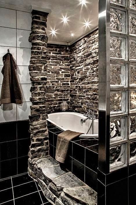
This bath combines the rustically erratic stacked fieldstone of the former (making rock's natural contours your steppingstone to your bath!) with the factory-processed glass block of the latter. 

The conventional floor and wall tile smooths out the composition as a mediator between these nature-vs.-machine polarities while providing a compatible contrast of its own: good old black-and-white.

However, opposites do have commonalities here. The wobbly texture of the glass bricks is simpatico with the rugged roughness of the stone, and the grays of the aluminum and the stones do jibe agreeably. And the common theme of the grayscale throughout the bath is the ultimate unifier here.

Photo courtesy of themetapicture.com
This takes the stone a step further, organically evolving the tub and shower out of existing ground-rock, bringing them back to their tidal-pool and swimming-hole roots. The wood-plank ceiling is a fine curvilinear complement to the contours of the rock-tub, keeping the scene natural and fluid, like the water and the rock it shaped over eons.


Photo courtesy of zillow.com
This bath "rocks" with nature, reframing the shower as the rain and the waterfall that were its origins. The stacked stones evoke nature's erosion of ancient ruins. The nature views (through one-way glass, hopefully) bring the real thing into the picture, so "it's like taking a shower in Ireland," as Irish Spring Soap jigged on the radio in the '70s.

Photo courtesy of homesdir.net
Totally dissolving its picture window, this one brings us one step closer to nature, the way it "throws open its walls like curtains to admit a plenitude of fresh air, daylight and sunshine" to the point of giving the bather the ultimate "public bath," hence a risk of embarrassment upon emerging from the tub should hunters or horseback riders happen to approach from afar. 

The white porcelain bowl-tub theme repeats itself admirably as twin bowl-sinks designed to appear detached. The knotty wood vanity brings more nature inside, while the mirror-doors on the medicine cabinets expand the effect of the box-burst into "light, space and greenery" of nature beyond the galley confines of the bath.

The result is a balanced compromise between nature and manufacture, neither one upstaging the other.

But when nature really calls and you really want a "bath to nature," take this nature connection a giant leap further and go soak in your outdoor hot tub...


...or jump in your backyard swimming pool! (Hey, it's summer, right?)

Thank you for visiting. I welcome your comments!

Of the hill


Norman Lykes House, Palm Canyon, Phoenix, Arizona, 1959, Frank Lloyd Wright.
Upper photo courtesy of Toptenrealestatedeals.com. Lower photo by Steve Hoge, courtesy of Flickr.
I knew well that no house should ever be on a hill or on anything. It should be of the hill. Belonging to it. Hill and home should live together each the happier for the other.

In his lifelong quest for an organic architecture that did not dominate the land as its Classical, Gothic and Victorian precursors did but integrated itself with it to become one with the Mother Earth that originated its materials, Wright combined site with structure in many of his designs. This allowed each to benefit from the other. The building mirrored and abstracted its environment's natural forms in its architecture while conserving its site to preserve nature's ecosystems and offer the picturesque natural views many a homebuyer would desire.
Photos courtesy of L'autre carnet de Jimidi.
The Norman Lykes House near Phoenix, Arizona, realizes his goal fully. Begun before his death in 1959 and completed in 1966, it seems to hibernate in the hill, curve with its contours, crag with its cliffs, and swoop with its sweep, affording its owners a wraparound panorama of Palm Canyon's mountainous desert country while providing fluid spaces that reflect human circulation patterns.

In the following images the house is so "of the hill" that it resists the urge to be "king of the hill." It defers to the hill's earthly dominion by not only letting its pool-users and porch entrants enjoy hill views but also not letting them forget the nature that originally created the house, as if it were a logical continuity of the hill.
Photo courtesy of Alexandru Luca of Pinterest.

Photo courtesy of L'autre carnet de Jimidi.

Notice how "on the hill" its neighbor is compared to the "belongingness" of the Lykes House. The neighbor diverts our attention from the nature onto itself with a white façade that counters the warm earthtones the Lykes House borrows from its rocky environs. Also, the neighbor's linear geometry, clearly man-made, clashes with the nature-made feel of the Lykes House's organic curves.
But Wright did not originate the "of the hill" ideal. Civil Engineering Discoveries, a New York-based "learning platform for all over the world," often posts images of hill-bound housing from all over the world that show us how diverse cultures have used the hill and mountain to best advantage for views, natural resources, health, remoteness, and unification of their homes with nature's majesty.

For example, these one-level houses on the Faroe Islands, a constituent country of the Kingdom of Denmark, have roofs sodded like the grass of the hill they stand on, bringing them closer to the ground than the Danish tradition of earth-hugging low-scale homes. This also enables the peaked gables to pay homage to the peaked mountains in the distance.
An earthier example: a Welsh house that reprises the Faroe Islands' sodde
d roof and one-story stature but takes its belongingness to the hill a step further by mimicking the hill's contours. It slopes up from the ground and slants slightly down to become more hill-like, allowing for a patio and hot-tub, though that mars the "eyelid" effect that would have made the house even hillier. But the fieldstone walls augment the house's earthiness by honoring its natural resources.
This residential community on the Amalfi Coast in Italy is arguably on the hill, built in the Classical, Italianate and Renaissance architectural traditions that Wright deemed notorious for counteracting nature's spontaneously organic fluidity with monumentally manmade pretension. 

Yet I think they're of the hill in their own way. For one, they sit precariously on a steep elevation, mirroring the craggy rocks of the adjoining cliffs, appearing just as vulnerable to nature's meteorological disruptions as nature is itself. But this siting is beneficial, too, stacking them down the cliff, which affords generous sun and sea air for all concerned. Also, their wide variety of colors reflect the diversity of flora that grows in those parts. 
Here is a more unified example of Italian hillside development, in Gangi, Sicily. 

Here the rowhouses are of a more uniform design and are more consistent in height, and the slate roofs are colored to reflect the terrain of the neighboring mountains. This makes them even more "of the hill" than the previous example. 

Furthermore, the variations in the roof heights seem to imitate the unevenness of natural mountain curves and undulations, while the roofs resemble the unified hue of the mountains, and the steep slope of their hill allows all of the houses the generous sunlight that pours onto the mountains, baking them into a golden brown.
Hobbiton, Matamata, New Zealand, built for Peter Jackson's The Lord of the Rings and The Hobbit films. Photo by Jackie.lck (CC BY 2.0).

Bilbo Baggins' hobbit-hole, Hobbiton Movie Set. Photo by Tom Hall (CC BY 2.0).
What would most delight Wright regarding of-the-hill habitation would be Hobbiton in Middle-earth (as constructed in Matamata, Waikato, New Zealand, as a movie set for Peter Jackson's The Lord of the Rings and The Hobbit films), the location of Bilbo Baggins' earth-tunneled hobbit-hole, as J.R.R. Tolkien himself described it in The Hobbit:

The tunnel wound on and on, going fairly but not quite straight into the side of the hill—The Hill, as all the people for many miles round called it—and many little round doors opened out of it, first on one side and then on another. No going upstairs for the hobbit: bedrooms, bathrooms, cellars, pantries (lots of these), wardrobes (he had whole rooms devoted to clothes), kitchens, dining rooms, all were on the same floor, and indeed on the same passage. The best rooms were on the left-hand side (going in), for these were the only ones to have windows, deep-set round windows looking over his garden and meadows beyond, sloping down to the river.

Now that's hill and home living together, each the happier for the other—and for Bilbo, to whom this marriage granted the luxury of one-level living and, as far as the earth could stretch, mansion-quality space he didn't have to build high on the hill to attain. Happy, that is, until the day Gandalf appeared at his perfectly circular green door...

Thank you for visiting. I welcome your comments!

Beauty in economy

This LinkedIn post from Civil Engineering Discoveries is the image of beauty in economy. This bathroom's restraint of space, finishes and fixtures radiates the cleanliness one gets from a good shower, shampoo and shave without hogging space from other rooms or dressing up in needless knickknacks.

The cantilevered sink, shelf and mirror are mounted on the shower's side, consolidating all cleansing stations and simplifying the plumbing. Similarly, the commode is right beside the shower, and the shower's off-the-floor step-in design has no threshold to trip on. This turns all daily necessities into one-stop shopping, hastening your toilet to help you get going in the morning.

Which is complemented—and expressed—by simplicity of design and décor. The glass door's black border exemplifies the clean lines of Mondrian modernism. The lighting around the simple square mirror nicely contrasts the black with white while complementing the white sink. The woodgrain of the vanity and shelf offset the shower door's industrial geometry with organic rustic richness, while the black metal faucet complements the door-frame. The shower's textured tilework suggests a showerhead's waterfall cascade in a way that isn't sculpturally pretentious but is still soothing.

This is living proof that you don't need a bathroom like a palace to have something luxurious to step into, steam up in and stride out of for your daily routine...unless, of course, you seek a soak in a tub. 

But, aside from hating baths as a kid, I frankly find tub-bathing unnecessary and time-consuming, especially when it makes you not want to leave the warmth of the water, the caress of the jets, the scent of the soap, the balm of the bath oil, the sudsy softness of the Mr. Bubble, and whatever other luxuries surround you. For that is how the tub usurps your valuable time as much as the square footage it requires robs the rest of your home of valuable space—and ups your renovation, installation, plumbing and water-and-sewer expenses in the process. 

So a douche from a shower (that is, a tightly vertical one-person one kept to the spatial limits of one showerhead, not a multi-headed haven with the elbow-room of a walk-in closet, like this stall here) does the trick for personal sanitation, spatial salvation, and time management in the morning. That should make the first image you saw in this post a model for economical yet elegant bath design.

Thank you for visiting. I welcome your comments!