 The New Architecture throws open its walls like curtains to admit a
plenitude of fresh air, daylight and sunshine.
 Instead of anchoring buildings ponderously into the ground with massive foundations, it poises them lightly, yet firmly, upon the face of the earth, and bodies itself forth, not in stylistic imitation of ornamental frippery, but in those simple and sharply modeled designs in which every part merges naturally into the comprehensive volume of the whole.
Thus its aesthetic meets our material and psychological requirements alike.
— Walter Gropius, The New Architecture and the Bauhaus, 1925
This was especially true in the bath, which Gropius limited to the bare-bones basics and confined to the bare-minimum galley space it needed to meet his family's fundamental needs. These baths in Gropius' 1938 house in Lincoln, Massachusetts, which he designed as his residence when he was professor and later dean of the Harvard Graduate School of Design, show how the industrial aesthetic of his Bauhaus School does meld into a unit. The consistency of black linoleum, chrome metal, white porcelain and curved edges forms the bath as a purely functional but adequately comfortable place to get in, get clean, and get out. For a "stylistic imitation of ornamental frippery" would tempt people to linger longer in the loo, captivated by the cosmetic eyeful, keeping other people waiting.
 |
| Photo by Cliff, courtesy of Wikimedia Commons |
Back to nature?
Yet some still want to feel natural, like this one, which flaunts the knots in its pine, the beams in its ceiling, the stones in its stairs and floor (and fireplace!), the wood-finish in its water-jet hot-tub, and the calculated window-view of evergreens and mountain ranges to make your bathing experience seem back to nature — though Mother Nature has fooled you this time by not providing these materials for free like in days of old. For the chandelier gives away the wealth spent on this, as does the gas fireplace that warms your towel-down after you (finally) get out of the tub.
 |
| Photo by Don Cochran, courtesy of Holmes, King, Kallquist & Associates |
Here the logs are more ornamental than structural and functional, never letting you lose sight of the "natural" wonder of those ringed cross-sections, hatchet-hews and bark-scars as you water-jet yourself soft and clean in the soaking tub, which is simply crafted so as not to distract from the subdued natural effect.
The variegated brown floor and shower tiles continue the woodsy, cavernous feel into the shower, but in a way that removes you further from Lincoln's struggles for survival, especially when you step into the shower's vast glassed space and turn on the massaging showerheads and steam-jets.
 |
| Photo courtesy of plumbingplus.net |
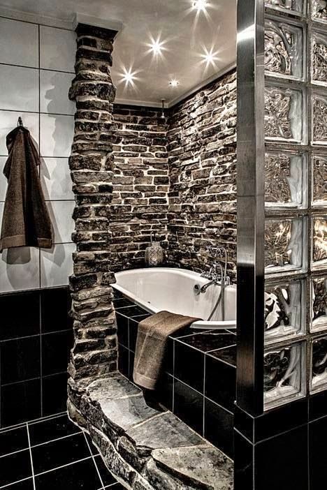
This bath combines the rustically erratic stacked fieldstone of the former (making rock's natural contours your steppingstone to your bath!) with the factory-processed glass block of the latter.
The conventional floor and wall tile smooths out the composition as a mediator between these nature-vs.-machine polarities while providing a compatible contrast of its own: good old black-and-white.
However, opposites do have commonalities here. The wobbly texture of the glass bricks is simpatico with the rugged roughness of the stone, and the grays of the aluminum and the stones do jibe agreeably. And the common theme of the grayscale throughout the bath is the ultimate unifier here.
 |
| Photo courtesy of themetapicture.com |
 |
| Photo courtesy of zillow.com |
 |
| Photo courtesy of homesdir.net |
The white porcelain bowl-tub theme repeats itself admirably as twin bowl-sinks designed to appear detached. The knotty wood vanity brings more nature inside, while the mirror-doors on the medicine cabinets expand the effect of the box-burst into "light, space and greenery" of nature beyond the galley confines of the bath.
The result is a balanced compromise between nature and manufacture, neither one upstaging the other.
Simple and sharp
Gropius' vision of "simple and sharply modeled designs" can go beyond the pragmatic into the stylistic, as this combo of clean lines, rich textures and curved forms shows. Frosted sea-green glass, woodgrain veneer, Carrara marble and pearly-white porcelain calmly complement the soothe of the bath, contrasted by the big-city vibrancy of the view.
 |
| M Lab-The Country Home, architonic.com |
 |
| Linc Thelen Design, lincthelendesign.wordpress.com |
'Ornamental frippery'
 |
| Photo courtesy of plumbingplus.net |
 |
| Photo courtesy of plumbingplus.net |
A fine line
 |
| Photo courtesy of FrenchyFancy.com |
 |
| Photo courtesy of adoreyourplace.com |
Thank you for visiting. I welcome your comments!


No comments:
Post a Comment