Sunday, December 30, 2018

The best light

Dyker Heights Christmas Lights 2008, Brooklyn, New York, courtesy of Pinterest
That was the topic of this year's Christmas Day homily at Trinity Church in Boston, regarding "Christ's light pushing back the darkness, reaching out in love," in the words of Interim Rector Bill Rich. 

This theme was in sync with my musings on the best ways to light homes for the holidays, which I had been observing and photographing in and around my Watertown area.

Home-lighting comes in all colors, iconic as well as chromatic: Nativity crèches, Santas, snowmen, Snoopys, menorahs, wreaths, candy canes, tree- trunk spirals, fence- rim strings, etc...

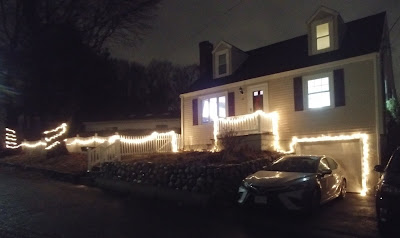
The best light, to me, highlights a home's structure, running along doors, rails, porches, etc. It makes a home more welcoming, both by driving back enough darkness to help you find your door and insert your key and by warmly inviting people in from the cold with the architecturally genuine expression of "home" that plastic idols lack.
For example, this eave lighting sings out "home" by emphasizing the familiar home image of the gable. It also allows soft light to radiate over the façade, aided by the lighting of the evergreen and shrubbery in front. This effect yields a holiday-appropriate mélange of brick-red and tree-green.

Here the stringing of lights along the entire post, rail and porch structure creates an illuminated path all the way from front walk to front door. This radiates the steps with a cool, calming blue to make the ascent home both softer and safer. It also sets off the porch as an aedicula of warm, calming welcome by giving it a structural expression of the solidity and serenity of the home it introduces.

The reindeer sculptures avoid the frippery of inner-lit Santas, Snoopys and Frostys by directly lighting the building, signifying to the owners that they have, indeed, returned home.

Here the lights give a simple porch the more lavish Italianate character of dripping ornament, dignifying one's entry inside. To complement this, their diverse colors and extension onto the balcony and stoop rails lend the house some of the "painted lady" element common on Victorian mansions of that period by radiating rainbow hues onto the rails. The result is a more colorful, festive welcome home without excessive fuss in ornament, decoration or light displays.
This is one way holiday lights can be decorative and functional simultaneously. Loosely hung from the porch eaves, they take the form of icicles erratically dripping from the gutters in the winter, while at the same time they powerfully illuminate the entire porch enclosure as a "blue room" of sorts, courtesy of the house's blue façade.

This effect evokes both the icy cold of winter outside and the warm light to come inside, making the porch a smooth transition space between the former and the latter by truly driving back the darkness in advance of one's entry into the light of home.


I love the way these lights spill down from entrance eave to double-stoop-rail to trees, illuminating one's entire path from walkway to steps to entry and complementing the menorah candelabra in each window, as an honest expression of the structures of necessity for good living.


This marvelous string of lights brings to light the interconnection among many parts of the housegarage door, front stoop, yard fence, shady trees expressed by swirls around their trunks—as well as the continuity of the property along the road, in one graceful gesture of motion up the hill.


These swags deviate from the structural linearity of most of the lights above for a more ornamental, festive effect, but one that celebrates the Roman grillwork structure of the rails by shedding more light onto it, for a dual celebration of both the light and its upholder. The Tuscan columns on the porch and upper balcony are given their due, too.


This joyous celebration of architecture with light guides the homecomer along the stone wall up the steps to the porch, while dramatizing the bay window as a festive framework for the display of a Christmas tree. The picket fence, too, glows with the glee of the season.


This blends structural expression and ornamental accent in a light display of the winter solstice spirit. Dangling lights give the Queen Anne eaves the aura of an icicle-encrusted Swiss chalet in the Alps, while a rich variation of light color and sculpture make the grounds dance with diversity.


Though this display is more decorative than delineative, the candy canes and color-circuses are nicely contrasted by a blue strip along the gutter and white semi- swags along the fence, reminding us of the structure of home as "our shelter from the stormy blast" of winter.


I thought I'd end this walk in the winter wonderland of luminescence on the ecclesiastical note on which I began it. By spiraling the lights around the columns, lining them up along the balcony, and stringing them along the arches and in wildly ethereal whimsies, structure is expressed magnanimously as a manifestation of the light of Christ. The freeform curves of light swooping and swirling toward the sidewalk reach out to the public as a gesture of invitation from, in Rev. Rich's words, "the light that seeks to share that light with any and all who receive it," so we can "see the light, touch it, and find our way home. This is incarnation. This is Christmas."

That is precisely how structurally strung lights help us find our way home. They not only push back the darkness enough to remind us where our home is, but they also affirm and celebrate the structure of that which gives us shelter, comfort, security, sustenance, and pride of place. 

That is what makes them the best light for the holidays. 


A Happy New Year to one and all!

Thank you for visiting! I welcome your comments!

Tuesday, September 11, 2018

From the ground up

The WTC site in 2008. Photo by Mike Roberts, courtesy of Flickr and Wikimedia Commons
Photo courtesy of nycsubway.org
The news of the grand reopening of New York City's World Trade Center–Cortlandt subway station on Sept. 8, 17 years after the collapsing Twin Towers crushed it down to crawlspace stature in the wake of the 9/11 attacks, provoked my reflections on how well the WTC site has been upward bound from the Ground Zero grave in general.
 
Photo by The All-Nite Images, courtesy of Flickr and Wikimedia Commons
Photo by Sebastian Sinisterra, courtesy of Wikimedia Commons
Photo courtesy of the MTA
Well, the station itself has rebounded nicely. For one, it sports the spotlessness it yearned for when graffiti displaced mosaics as public art. Also, it reinvents the mosaic with Ann Hamilton's interweaving of marble tesserae mosaic tiles with bits of the Declaration of Independence and the United Nations Universal Declaration of Human Rights.

Photo by Hu Totya, courtesy of Wikimedia Commons
This white marble tapestry boldly reaffirms the unshakeable freedoms that were under siege on that fateful day (as the wall's rough texture conveys, alluding to the jagged remains of the Towers' concrete basements in the aftermath of the attacks). Yet one notices the chosen font's similarity to that on Maya Lin's 1982 Vietnam Veterans Memorial in Washington, D.C. (right)

The reuse of this subdued but straightforward font may give the subway a fitting "memorial" quality in its provocation of serene remembrance of the fallen. Yet it deprives the newer work of true originality, as an example of the imitators Lin's groundbreaking design spawned.
 
Photo by Edgar El, courtesy of Panoramio and Wikimedia Commons
Ditto for the 9/11 Memorial, the least successful element of the WTC's reboot. My visit there on Sept. 11, 2016, was met with disillusion at the site's sacred centerpiece. Michael Arad's attempt to consecrate the Twin Towers' footprints in remembrance of the victims is an obvious emulation of the solemnity of Lin's black granite wall of names—and a less effective one at that.
 
Photo by Luigi Novi, courtesy of Wikimedia Commons
As their gilding shows, this is also a crass commercialization of the tragedy in the name of the real-estate polish that revived the site's "trade" side. The waterfall fountains resemble those in office-building plazas and parks, and would have benefited from integration of the rugged remains of the Towers' concrete wall basements into the memorial rather than putting one of them in the museum. 
 
Photo by Billy Hathorn, courtesy of Wikimedia Commons
Waterfalls gushing down these roughened edifices would have imbued the pools with the naturalistic effect of real waterfalls and breaking ocean waves cascading and clashing on craggy rocks. Such a "ruins" effect would have given the pools a truly remember-the-dead quality, akin to Alfred, Lord Tennyson's ode to his late friend Arthur Hallam:
Break, break, break,
At the foot of thy crags, O Sea!
But the tender grace of a day that is dead,
Will never come back to me.
 
Photo by Cadiomals, courtesy of Wikimedia Commons
Photo by Az1568, courtesy of Wikimedia Commons
Nor are the bases of the pools convincing as memorials. The rectangular holes in their centers are nothing but grill-less catchbasins for the falling water, more functional than evocative. A stronger element would have been a stepped descending shaft in the form of an inverted, inside-out ziggurat for the water to cascade downward to the central drain below. This would have fittingly recalled Egyptian burial rites, evoked the scary uncertainty of dropping downward into an abyss, and alluded to the Survivors' Staircase, the remnant of the Towers' original escape route now monumentalized in the museum (right). As it stands, the 9/11 Memorial's theme of "Reflecting Absence" conveys that concept too literally, neutralizing the tragedy into a slick lunchtime oasis of polished, gold-lettered granite like a typical office-park branding embellishment, thereby leaving us absent of much emotional connection to the victims.


Photo by Luigi Novi, courtesy of Wikimedia Commons
The 9/11 Museum connects us more to the event by virtue of its gridded, erratically angled metallic envelope and slanted stature. This evokes both the fall of the vertically gridded Towers and the sinking of ships like the Titanic, as a monument to common characteristics of these disasters: human vulnerability in the trap of technological fallacy, and caged confinement in the envelopment of man-made mortality.

Friday, June 15, 2018

The Little in limbo

From stone to bone.

From regal to rusty.


From grand to gross.


From icon to eyesore.


From stately to studs.


From dignified to dull.

From graceful to grimy.

From eminent to empty.

From elegant to elephantine.

From Little to...little.

Such was the essence of my shock upon emerging from Boylston Street Station to find the Little Building, a Beaux-arts landmark that had regally anchored Boston's Boylston-Tremont corner for 101 years, shorn of its stonework and stripped to its structure. 

Now it is but a somber specter of its former self, a snake bereft of its skin, 'dem dry bones disconnected, in limbo between actuality and potentiality, solid and void, erection and demolition.


No, not 'erection' in the turn-on sense of the word—though it perplexed me what could possibly have prompted Emerson College to have its main dormitory perform the architectonic equivalent of the strip-tease acts that had flocked the sex-starved to the Combat Zone (left) down the block a generation ago.

Only this time the naked limbs and spread legs reveal nothing stimulating, just the barren steel skeleton and vapid 'fly space' of Emerson's next big act: "replacing/restoring the façade of the Little Building as well as interior renovations on floors 2-12 and the construction of a new 13th floor located behind a 14-foot, 4-inch parapet," as the Boston Planning and Development Agency (formerly the BRA/Boston Redevelopment Authority) proudly trumpets on its website. Designed by Elkus Manfredi (who else?), this facelift/bowel-cleansing "will add 294 new beds to the building." To boot, the lightwells will be glassed in (to create luxury student lounges, no doubt), bridging the gap between old and new in the name of progress and regress.

Speaking of regress, let's go back a bit to see what kind of building is being belittled. It was built in 1917 by dry-goods merchant John Mason Little as what was then deemed a "skyscraper" by Boston standards, conforming to the roofline the Colonial Theatre building had established. The architects were Blackall, Clapp & Whittemore; Clarence Blackall designed the Colonial in 1900, along with the Wilbur (1914), the Wang (1925) and many other Boston theaters.
The Little Building's Gothic limestone-colored terra cotta detailing was likely inspired by that of New York's Woolworth Building (1912, Cass Gilbert, right), which had set a precedent for the "cathedral of commerce" as an ecclesiastical symbol of upward mobility and the sanctity of financial gain. The Little's projecting bay windows were distinctly Bostonian, however. This aesthetic amalgam of styles motivated historian Walter Muir Whitehill to deem the Little Building "the most glamorous office building of the era of World War I."
It was one of the most ahead of its time as well. Promoted as "The City Under One Roof" (left), it was an early example of transit-oriented mixed- use development. It housed 900 offices in one central location across the street from a subway entrance (it even contained one of its own). On its street level was an arcade of 15 stores, 22 boutiques of "distinctive and correct merchandise," a post office, restaurants, a basement Automat for the meager of budget, and corridors offering egress to the abutting Colonial Theatre on Boylston and Majestic Theatre on Tremont (both of which Emerson owns as well). The arcade formed an atrium with handy passage among second-floor stores along a Gothic lace collar with a connecting bridge about midway, making shopping and dining an architecturally and spatially awe-inspiring experience.

Artistically, too, for 19 of the elliptical arches above the street-level shops each contained a mural of a scene from Boston history, including...
...the Towne House (1657) that the Old State House replaced in 1711...

...the leveling of Beacon Hill (1811), with the new State House (1795)...
...and the East Boston shipyard of Donald McKay. His "Flying Cloud"
clipper ship set the world's sailing record for the fastest voyage from
New York to San Francisco (89 days, 8 hours) in 1851, only to break
its own record by making the same route around South America's
Cape Horn in 13 hours less time in 1853.


Given the dark, cavernous void that now lurks beyond the grand Tudor entrance, I shudder when I think of what became of those murals and Gothic details Emerson had restored after acquiring the Little Building in 1994. They defined an interior street for the modern office worker to shop, dine and mail conveniently with a touch of class, and receive a little Boston history lesson along the way.

Sunday, April 1, 2018

Richardson's Resurrection

Easter's occurrence on April Fool's Day happened only twice in the lifetime of Trinity Church's sexagenarian Interim Rector William W. Rich, as he mentioned in his sermon that Sunday. 

And this uncommon convergence of the sacred and the profane wasn't entirely jarring. Mary Magdalene, James' mother Mary, and Salome were arguably April-fooled by Jesus' absence from the tomb when they arrived to anoint his body with spices (Mark 16:1-8). 

But regardless of whether "Happy Easter!" or "April Fool!" dominated my celebratory impulses that day, I thought the best way to observe this rare hybrid holiday was to suspend my agnostic disbelief and attend an Easter service at one of Boston's greatest architectural manifestations of the Resurrection: Henry Hobson Richardson's Trinity Church in Copley Square.

As I stood in line for the noon service, the 1877 granite-and-sandstone landmark seemed to take a new form, as a transformation of the stone rolled away from Jesus' tomb into something richly symbolic, robustly everlasting, romantically upward-tending. Its pyramidal form emphasized the mass of its stone, while its grand central tower, flanking turrets and pedimented arches evoked a transcendence of the heft of the material from heavy to Heaven, "rising out of Copley Square like a mountain of stone," as a 19th-century Boston writer observed.

And in this mountain shall the Lord of hosts make unto all people a feast of fat things, a feast of
wines on the lees, of fat things full of marrow, of wines on the lees well refined.
(Isaiah 25:6, KJV)
This phrase from that service's First Lesson describes Trinity to a T—not merely alluding to the fat figure of original pastor Phillips Brooks that necessitated wider doorways in the church, but denoting the decorative equivalent of the "feast...of rich food filled with marrow, of well-aged wines strained clear" (the actual words from that Sunday's lesson) that was in store for the parishioners upon entering the mountainous megachurch. The offerings of opulence include opalescent stained-glass windows and egg-tempera paintings by John LaFarge, painted-glass windows by Edward Burne-Jones and William Morris, a painted suter window by Charles Mills, sculpture by Daniel Chester French and Augustus Saint-Gaudens, glass mosaics on the altar, and intricate stenciling throughout. These, coupled with the use of Red Longmeadow sandstone to create bands of color and carvings of the Apostles, Saints and vegetal capitals on the exterior, manifested Brooks' goals for Trinity: "to create as perfect a place of worship as possible, and to create a place of worship as beautiful as possible"—in short, to express the Heaven of Jesus' ascension.
I was glad when they said unto me, Let us go into the house of the Lord. Our feet shall stand
within thy gates, O Jerusalem. Jerusalem is builded as a city that is compact together... Peace
be within thy walls, and prosperity within thy palaces.
(Psalm 122:1-3, 7, KJV)
The newcomer to Trinity might well be April-fooled by the interior's unconventional layout and circus of color, with the dramatic wingspread of its transepts, the soar of its quadruple-arched central tower, and the boisterous bulge of its apse, and its prosperity of rich décor. But the balanced equilibrium among all of these elements—courtesy of the compact Greek-cross configuration—democratizes the sanctuary with proper Athenian aptitude to make everyone feel more welcome than overwhelmed. The spatial effect is more like a squared-off meeting-house ambiance than the nave-apse hierarchy of the typical church's Latin-cross form. This immaculate blend of art and architecture extols Jesus' earthly all-inclusiveness and heavenly omnipotence simultaneously.

The tower's central squareness affirms the balanced equality of all parts, and its soar emphasizes the Resurrection's supreme centrality to Christianity. The clerestory windows extol the heavenly light of Jesus' ascent, bookended by images of him from Clayton & Bell's English Medieval apse windows depicting stages in his life and John LaFarge's Christ Preaching over the organ loft.


Roman arches are not only central to Richardson's trademark Richardsonian Romanesque style. They are the load-bearing structure of the central tower, bolstered by iron ties to prevent buckling and to distribute the weight evenly. The ties are decoratively covered in carved wood to blend them with the artful elegance of the church, which also includes...
 
...John LaFarge's egg tempera painting
of David in the central tower...

  And it came to pass, when the evil spirit from God was upon Saul, that
David took an harp, and played with his hand: so Saul was refreshed,
and was well, and the evil spirit departed from him. 
(I Samuel 16:23)

...LaFarge's painting of Jesus' conversation with Nicodemus...

There was a man of the Pharisees, named Nicodemus, a ruler of the Jews: The same came to Jesus by night, and said unto 
him, Rabbi, we know that thou art a teacher come from God: for no man can do these miracles that thou doest, except God 
be with him. Jesus answered and said unto him, Verily, verily, I say unto thee, Except a man be born again, he cannot see 
the kingdom of God. (John 3:1-3)

...LaFarge's image of Jesus instructing a Samaritan woman...

There cometh a woman of Samaria to draw water: Jesus saith unto her, Give me to drink... Then saith the woman of Samaria 
unto him, How is it that thou, being a Jew, askest drink of me, which am a woman of Samaria? for the Jews have no dealings 
with the Samaritans. Jesus answered and said unto her, If thou knewest the gift of God, and who it is that saith to thee, Give 
me to drink; thou wouldest have asked of him, and he would have given thee living water... Whosoever drinketh of this water 
shall thirst again: But whosoever drinketh of the water that I shall give him shall never thirst; but the water that I shall give 
him shall be in him a well of water springing up into everlasting life. (John 4:7-14)

...The Adoration of the Shepherds, The Adoration of the Magi, and The Flight into Egypt by
Edward Burne-Jones and William Morris...


And it came to pass, as the angels were gone away from them into heaven, the shepherds said one to another, Let us now go
even unto Bethlehem, and see this thing which is come to pass, which the Lord hath made known unto us. 
And they came with
haste, and found Mary, and Joseph, and the babe lying in a manger. And when 
they had seen it, they made known abroad the
saying which was told them concerning this child. And all they that heard it wondered at those things which were told them
by the shepherds.
(Luke 2:15-18)


And when they were come into the house, they saw the young child with Mary his mother, and fell down, and worshipped
him: and when they had opened their treasures, they presented unto him gifts; gold, and frankincense and myrrh. 
And being
warned of God in a dream that they should not return to Herod, they departed into their own country another way.
(Matthew
2:11-12)


And when they were departed, behold, the angel of the Lord appeareth to Joseph in a dream, saying, Arise, and take the 
young child and his mother, and flee into Egypt, and be thou there until I bring thee word: for Herod will seek the young child 
to destroy him. When he arose, he took the young child and his mother by night, and departed into Egypt: And was there until 
the death of Herod: that it might be fulfilled which was spoken of the Lord by the prophet, saying, Out of Egypt have I called 
my son. (Matthew 2:13-15)
...and Eugène Oudinot's French Renaissance triptych of events surrounding the Resurrection.

And the angel answered and said unto the women, Fear not ye: for I know that ye seek Jesus, which was crucified. He is not 
here: for he is risen, as he said. (Matthew 28:5-6)

Jesus saith unto her, Touch me not; for I am not yet ascended to my Father: but go to my brethren, and say unto them, I 
ascend unto my Father, and your Father; and to my God, and your God. (John 20:17)

Cretes and Arabians, we do hear them speak in our tongues the wonderful works of God. (Acts 2:11)