Sunday, September 6, 2020

Lost in the library...

Main entrance hall, New York Public Library, Main Branch (1911, Carrère & Hastings). Photo: Alex Proimos. License: CC BY 2.0.

Stacks, New York Public Library. Archival photo.
The library is more than a storehouse of knowledge. It's a bastion of logic.

I don't just mean the logical reasoning its patrons hoped we would nurture through reams of reading and research in its hallowed halls and stately stacks. 

I'm referring to the logical layout users expect of it upon entering—a proper progression of rooms, sequential adherence to the Dewey Decimal System (if used), clear wayfinding signs and nodes, etc.—so they won't have to hound elusive mountain goats or be waylaid by red herrings to track down a desired book or paper, claim a cubicle or computer, or reach a restroom in time.

Portico, New York Public Library. Photo: GK tramrunner229. License: CC BY-SA 3.0.
After all, no one wants a library experience like a wild duck hunt through Super Stop & Shop, a quest for a lost kid at Six Flags, or a scramble for budget parking in New York. Yet some libraries venture beyond their book repository and study hall roles so surreally I'd love to get lost in them, if only to gawk at their glory, eye their ornament, fixate on their frescoes, or thirst for the thought resting on their sky-high shelves. 

Besides, midcentury modern libes are as antiseptic as ERs. So why not enjoy a circus of sights while combing the collections, as either a diversion from studies or an artistic experience of the library's intellectual depth?

Library, Trinity College Dublin (1732, Thomas Burgh). Photo: David Iliff. License: CC BY-SA 4.0
In the Long Room at the Library of Trinity College, Dublin, the towers of gold-lettered leatherbound tomes are the main attraction, piquing our awe at the expanse of scholarship within those vaulting volumes, expressed by the barrel-vaulted ceiling and the forever feel of the hall that invites us to wander and ponder the leathery linguistics, wondering what food for thought to feast on first and get lost in last.
Library, University Club of New York (1899, Charles Follen McKim).
The University Club of New York library follows the Long Room's symmetrical hall-procession conservatism, adding the extravaganza of gilded moldings, painted patterns and storybook frescoes on groin vaults, divinely inspired by the Vatican's Borgia Apartments. These elements proclaim the club-clique exclusivity regarding who dares parade its premises and peruse its precious books. This contrasts with the bare-bones barrel-vaulting and structural emphasis that makes Trinity feel more publicly accessible (the Club Library, BTW, is not) in a way that is awe-inspiring but not effusive of the Club Library's palatial pomp.

Library, Clementinum, Prague, Czech Republic (1722, Kilian Ignatz Dientzenhofer,
frescoes painted 1727 by Jan Hiebel). Photo: Bruno Delzant. License: CC BY 2.0
The Baroque Library, dedicated in 1722 for the Jesuit university at Klementium in Prague, pushes the pomp further skyward with spiral columns raising the eye to the barrel-vaulted ceiling of Jan Hiebl's frescoes of 
allegorical motifs of education and portraits of Jesuit saints and university patrons. Add the geographical and astronomical globes and clocks and the old books, and intellectual stimulation never stops.
Admont Abbey Library (1776, Joseph Hueber), Admont, Austria
Photo by Jorge Royan (License: CC BY-SA 3.0)
Austria's Admont Abbey Library honors the Enlightenment with 48 windows lighting the white-and-gold palette,
 Bartolomeo Altomonte's frescoes of the stages of human knowledge through Divine Revelation, Baroque curlicues vaulting for heavenly realms, and the 70,000 volumes the visuals may stimulate you to be lost in enlightenment in.
George Peabody Library (1878, Edmund George Lind), Baltimore, Maryland.
Photo by Matthew Petroff (CC BY-SA 3.0).
The George Peabody Library is often pictured on ads for travel to Baltimore, and I'm not surprised. Deemed a "cathedral of books" by its first provost Nathaniel H. Morison, this 1878 neo-Greco palace presents the architectural equivalent of gilded tomes: gold-scalloped columns of cast-iron-railed book-stacks soar from a marble floor to a 61-foot latticed skylight, inviting us to lose ourselves in the light of knowledge.
Salt Lake City Public Library (2003, Moshe Safdie & Associates and VCBO Architecture)
Photo by Nova77 (GNU Free Documentation License)
But is lavish ornament necessary to enjoy loss in the library? At least not since Moshe Safdie's Salt Lake City Public Library was dedicated in 2003, flaunting enough curves, catwalks, 
curtain walls, cathedral ceilings and interspatial odysseys to strike awe in Archie's gang:

BETTY: It's...it's awesome!
CHUCK: Wow! And double wow!
JUGHEAD: Throw in a triple wow for me! (Archie #570)
 
Eager to eat up as much space as food (if not learning), Jughead nailed it regarding not just the library's astronomical dimensions, but also its expression of the infinite information the libes now possess, kudos to what bounds beyond bookshelf growth: cyberspace and the Internet. 

Now that's something to get lost in.

Thank you for visiting. I welcome your comments!

Balancing the Biltmores

Photo by Tony "the Marine" Santiago, courtesy of Wikimedia Commons
The Biltmore Hotel first piqued my interest while watching Abbott and Costello on TV when I was a kid. In one sketch, once they managed to shut both the hood and the trunk of their car (shutting one made the other open) and stuffed their raft in the back, Bud told Lou to drive them to "the Biltmore Hotel near Phoenix" for their vacation. Lou stopped at the Biltmore next door. A row ensued:

BUD: "I said the Biltmore Hotel in Phoenix!"

LOU: "Well, it's the Biltmore Hotel right next to Phoenix Coffee Shop."

BUD: "I meant the Biltmore Hotel in Phoenix, Arizona!"

At that point my father informed me that there was also a Biltmore Hotel in Los Angeles, the city in which Bud and Lou lived (or barely lived; they were perpetually unemployed actors at the mercy of Mr. Fields, their cantankerous landlord) on The Abbott and Costello Show

So now that COVID-19 has put the kibosh on our plans to satiate our summertime wanderlusts, I thought I'd let my mind wander a bit and compare the two hotels—totally different in style, but miraculously built in the same decade—to see which might have been the better vacation resort for the legendary comedy team.
 
First of all, neither of the Biltmores looks anything like the one Lou stopped at, which confusedly intermingles the classicism of the Los Angeles Biltmore and the Art Deco of the Arizona Biltmore. (Nor was Phoenix Coffee Shop a real place.)

The Los Angeles Biltmore

L.A.'s "Biltmore Angel"—designed as a symbol of the City of the Angels its patrons were visiting—brought Beaux Arts beauty and Renaissance regalia to the city when it opened to festive fanfare in 1923. Since then it has hosted history in the making, from the Academy Awards to the arrival of the Beatles to the Democratic National Convention that nominated John F. Kennedy for President in 1960. Restored and reopened as the Millennium Biltmore in 2009, it remains the host with the most.

Photos by P.G. Roy Photography, courtesy of Wikimedia Commons
Leonard Schultze and S. Fullerton Weaver, architects of New York’s Pierre and Waldorf-Astoria hotels, designed the Biltmore in a mélange of Beaux-Arts, Mediterranean and Spanish-Italian Renaissance styles, befitting both L.A.’s Castilian heritage and Roaring '20s fashions.
Murals, frescoes, imported crystal chandeliers, carved marble fountains and columns, massive drapery and other delights embellish the Los Angeles Biltmore's 70,000 square feet of meeting, lounging, dining and club space, often integrating images of the “Biltmore Angel” into its lavish ornamentation.
The Biltmore's original 1,500 guestrooms included a Presidential Suite, where the Beatles stayed during their 1964 U.S. tour, accessing it by landing a helicopter on the hotel roof to avoid the hordes of screaming fans below. Latter-day renovations reduced the room count to 683 but restored the common areas to their ’20s twinkle.

Italian artist Giovanni Smeraldi, who painted murals in the Vatican and
the White House, hand-painted angels, cupids, Greek and Roman gods,
and other mythological figures on the ceilings of the Galleria...
 ...and the Crystal Ballroom, where the Academy of Motion Picture Arts
and
Sciences was founded at a luncheon banquet in 1927. Smeraldi's
apprentice, Anthony Heinsbergen, restored the ceilings in the 1980s.
Reliefs of Roman deities Ceres and Neptune and Spanish conquistadors
Balboa and Columbus adorn the Palladian entrance.
The lobby retains the travertine walls, oak paneling and artificial
skylight ceiling from when it was the Music Room, where Kennedy
set up his presidential campaign headquarters.
The Rendezvous Court, the old lobby-turned-tearoom, features a
Moorish cast-plaster beamed ceiling accented in gold paint, Italian
chandeliers, and a Spanish-Baroque bronze doorway with an
astrological clock that still works.
Each ballroom is decorated in remembrance of its original function
or in keeping with the hotel's California heritage. The Emerald
Room, formerly the main dining room, has a food theme: hand-
painted animals and fish along cast-plaster ceiling beams.
The Tiffany Room, originally the Crystal Ballroom’s drop-off
corridor, features exploration-themed reliefs and sculptures of
Queen Isabella, Columbus and other Spanish explorers.
The Gold Room combines an old upper-level supper club and lower-
level palm room in an artful ambiance of hand-oiled wood paneling,
mirrored windows, and concealed liquor cabinets from Prohibition.
A nautical theme dominates the indoor pool and health club. Brass
railings and window/door trim, teakwood deck chairs, and hand-laid
Italian mosaic wall and pool tiles recall 1920s cruiseliners.
The South Galleria’s Roman columns, marble balustrades and vaulted
ceiling are complemented with Pompeii-styled floral friezes.
In the Biltmore Bowl downstairs, eight Academy Award ceremonies
took place between 1931 and 1942, making Best Picture legends of
Cimarron, It Happened One Night, Mutiny on the Bounty,
The
Great Ziegfeld, The Life of Emile Zola, You Can't Take it With
You, Rebecca,
and How Green Was My Valley.
Since Abbott and Costello's 1941 movie Buck Privates got two Oscar nominations (Best Original Song for "Boogie Woogie Bugle Boy," sung by the Andrews Sisters, and Best Original Music Score for Charles Previn), they might have felt at home at the L.A. Biltmore...had it not been for Lou's tendency to get lost in big spaces, experience supernatural phenomena such as paintings or statues coming alive, and fail to convince Bud of the truth of these tales. Besides, this hotel's sheer size might have made his cries of "HEYYYYY, AAAAABBUHHHHHHHHTT!" go unheard by his buddy.

So let's get to Phoenix...

The Arizona Biltmore

Built in 1929, the Arizona Biltmore was designed by Albert Chase McArthur in the horizontal, earthy, Prairie-School, Mayan temple-based vernacular of his former teacher Frank Lloyd Wright, who was the design consultant. Though Wright was displeased with the final design, McArthur clearly took so much from the master it's easy to mistake it for a Wright original...

All photos by Tony "the Marine" Santiago, aka Marine 69-71 (License: CC BY-SA 4.0).
...especially regarding the use of desert sand-casted concrete blocks to create surface patterns inspired by palm-tree trunks and Native American woven fabrics. Wright preferred square Textile Blocks like those on his Derby, Ennis and Hollyhock houses, but MacArthur stood his ground, and his building blocks became known as the "Biltmore Blocks" for giving the Biltmore a unique geometric pattern recalling the movement of water ripples, fish gills, billowing sails...

...or smoke rising from the fireplaces. In the Mystery Room, the billowy blocks on the mantel suggest the movement of flames in the hearth and smoke up the flue, accented by the upward pointing of the "Indian arrowhead" andirons. I also love the way the cove-lighting gilds the cornice without the application of gold paint common in the LA Biltmore.

The cove-lit cornice also complements and contrasts the Mystery Room's stained-glass ceiling, for the effect of natural light in the day and artificial light in the evening, each adding splashes of color without the need for applied décor, except for the ceiling gilding that blends with both, smoothing the day-to-night transition.


The Biltmore blocks—which do bear a slight resemblance to the ornamentation around Abbott & Costello's "Biltmore"— also contribute to the sense of fluid movement throughout the hotel's lobby, as a counterpoint to the static feel of the more vertically oriented Los Angeles Biltmore. The Arizona Biltmore lobby's spatial continuity would certainly make it easier for Lou to flee from the dangers he couldn't convince Bud of the truth of...or for his "HEYYYYY, AAAAABBUHHHHHHHHTT!" alarm to be more loud and clear along the long, continuous space.

Bud would clearly hear Lou's bawl in the Biltmore's original ballroom, the
 Aztec Room. A geometric mandala radiates on the carpet while copper beams, slanting gilt ceiling panels and Biltmore-Block filigrees augment the sense of upward and inward motion toward the sun, honoring the artfully domineering temples of Mexico's Aztec Empire.

The Gold Room would be another resonant echo-chamber for Lou's holler of helplessness, with its unobstructed corridor-space and its ceiling slanting to just enough of an apex for acoustic enhancement while maintaining the hotel's low-slung horizontality, helped by low-rise stairs. Geometric sconce stacks and billowy Biltmore Blocks add an Aztec aura.

Here was a place for Bud and Lou to splash their raft and join the nabobs who dipped here: the Catalina Pool. Built in the 1930s by Chicago chewing-gum king William Wrigley Jr., it was reportedly Marilyn Monroe's favorite pool. Irving Berlin wrote many songs while sunning on the deck, including "White Christmas," which opens with a nod to the climate he was in:
The Catalina Pool fountain.
The sun is shining, the grass is green,
The orange and palm trees sway.
There's never been such a day
In Beverly Hills, L.A.
But it's December the twenty-fourth,
And I am longing to be up North.

Though it was the Biltmore's Beaux-Arts bro that was actually in L.A., Berlin nailed the ambiance of the Arizona Bilt to the hilt, with a twist of irony: since winter frigidity makes us miss summer humidity, why the opposite now?

Balancing the Biltmores
 
And speaking of opposites: It's clear which Biltmore Bud and Lou preferred. Which one would best cure your summertime blues?

Thank you for visiting. I welcome your comments!

Saturday, September 5, 2020

How trees shape context

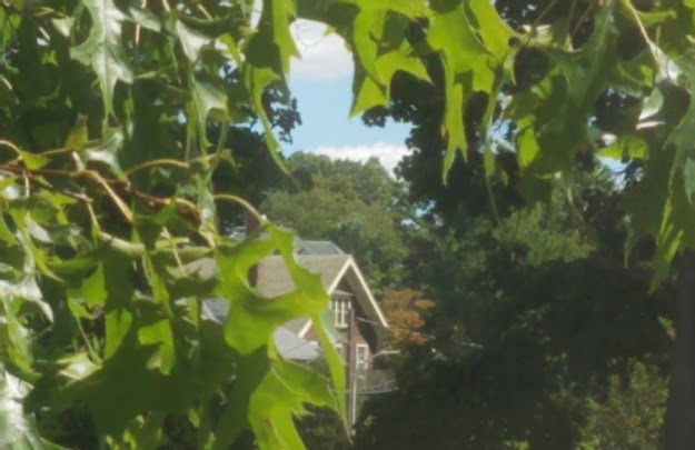
POP QUIZ: Where do you think this is?

(a) Arber, Germany

(b) Bergen, Norway

(c) Bernese Oberland, Switzerland

(d) Watertown, Massachusetts, USA

Stumped? I don't blame you. Looks can be deceiving when trees shroud enough environmental details to frame a building in a new context that obscures its original one, as if Photoshopping out the extraneous to capture the essence, or doing nature's duty to bring out beauty. 

Photo by Cristo Vlahos. License: CC BY-SA 3.0.
That's how trees bring fresh form to architecture by softening its edges and extensions with serene green. This harmonizes it with the nature that created it and enriches its sheltering capacity with shade to block or diffuse the sun, evapo- transpiration
 to supplement the shade by cooling the air, and photosynthesis to reduce the building's carbon footprint. 

BTW, the answer is (d). The house pictured above is viewed from my bedroom window. The chalet at right is in fact in Bernese Oberland, showing how trees and other greenery create appealing scenery that brings out the chalet's woodsy character, complementing its honest expression of the origin of its building materials.
Here's another instance of tree-trim from my own experience. When I went up a steeply inclined avenue to look at a room for rent at its summit, I was stunned by the scene before me. It looked and felt as if I'd just stepped into the flatlands of Denmark, the way the avenue suddenly leveled out and the trees seemed to highlight the European aspects of the architecture through their international arboreal language.

This was the house, looking Scandinavian in its clean-lined simplicity, bolstered by backyard and street-lining trees that crispen its appearance by contrasting it with the heft of shade, as well as the complement of the archetypal white picket fence of suburban America.

Which gives it away that this is not in Denmark. It's at the crest of Summit Avenue in Brookline, Massachusetts, a block or so from Corey Hill Park. That hilltop oasis also testifies to the power of trees in space-shaping and sight-softening, without which the rocks, furniture, turf, paving and background buildings would seem as barren, hard and dry as a rocky desert or smoggy city (and the atmosphere would feel like either):

Photos by Maurene K., courtesy of TripAdvisor

Here are examples of Denmark's benchmarks of tree-effect:

Photo by Okin. License: CC BY-SA 3.0
This setting on the 
Coast of Skagen in Northern Jutland shows how isolated a home can look with no tree-neighbors. Trees connect a structure to the world around it by making the building and its occupants seem less isolated. Trees on a house's grounds also give a sense that the owners are receiving proper nourishment from the Mother Earth that provided the building material and their food and drink.
Image courtesy of Best-Wallpaper.net
This one's more like it. The trees and their lake reflection envelop the house in green, which pacifies its milieu, complements its half-timbering and thatched roof, and highlights its orange walls with color-contrast. A sense of 'cool' pervades the place: cooling of the air by the trees, cool water, cool-blue sky—contrasting the 'hot' effect of the deserted house above.
Photo by Dr. James Garner Williams (License: CC BY-SA 2.5)
Similarly, these trees halo the Academy Building at Phillips Exeter Academy in New Hampshire, cloaking the clocked cupola of Ralph Adams Cram's 1914 Georgian Revival edifice in a festoon of greenery, affirming the campus as the "separate peace" John Knowles depicted the Devon School as in his novel of that name:
Between the buildings, elms curved so high that you ceased to remember their height until you looked above the familiar trunks and the lowest umbrellas of leaves and took in the lofty complex they held high above, branches and branches of branches, a world of branches with an infinity of leaves.


So, wherever under the blue sky you are—
Arber, Bergen, Bernese Oberland, Watertown, or right in your own back yard—be sure to look between the buildings for that infinity of leaves without which any house, hall or high-rise would look like a son of the desert, rather than a child of nature.

Thank you for visiting. I welcome your comments!