Unlike the Hooverville humbug of his predecessor's, Franklin D. Roosevelt enriched his own Presidential Library and Museum in Hyde Park, N.Y., with a humble country charm.
 |
| Preliminary sketch by Franklin D. Roosevelt of his own presidential library and museum. |
 |
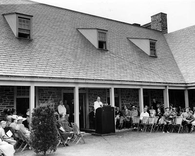
| President Roosevelt dedicates his museum on June 30, 1941. |
...his Fireside Chats, which he often broadcast from his library's study over the course of World War II, keeping listeners abreast of the war's progress, announcing war loan drives, and presenting peace plans. The library's house-like feel set the tone for these intimate moments with his fellow citizens, assuring them, indeed, "we have nothing to fear but fear itself."
 |
| Photo by Wallygva, courtesy of Wikimedia Commons |
FDR also spent many hours in the study sorting and classifying his records and collections from his terms as New York state senator and governor, assistant Navy secretary and President. Thus he began the presidential tradition of erecting a special facility for the archiving of a president's papers and public display of his era's memorabilia.
The trouble with Harry
 |
| Photo courtesy of the National Park Service |
 |
| Photo courtesy of the National Archives |
Which may partially explain why this structure is, indeed, as dead-looking as a U.S. Army base or the Pentagon, hence as cold as the comfort Truman took in his heinous decisions to H-bomb Hiroshima, nuke Nagasaki, and kick off the Cold War with the Korean Conflict.
 |
| Photo by Nationalparks, courtesy of Wikimedia Commons |
Determined to be as old-hat as his trademark haberdashery, Truman set up a working office in the library to supervise its daily operations and furnished it FDR-style with classic bookcases and lights, paneled doors, a crown molding, a vintage desk and world globe, and other artifacts of a passing era. Here he wrote articles, letters, and his memoir, Mr. Citizen.
Eisenhower eye-to-eye
 Harry
S. Truman and Dwight D. Eisenhower were so at odds with each other that
President Eisenhower not only skipped Truman's library dedication but
also urged Herbert Hoover to do the same. (Hoover went anyway; "one of
the important jobs of our exclusive trade union is preserving
libraries," as he told Truman.)
Harry
S. Truman and Dwight D. Eisenhower were so at odds with each other that
President Eisenhower not only skipped Truman's library dedication but
also urged Herbert Hoover to do the same. (Hoover went anyway; "one of
the important jobs of our exclusive trade union is preserving
libraries," as he told Truman.)When time tempered those tensions after Ike left office, he visited Truman's library to get inspiration for his own in Abilene, Kansas (and no wonder: Truman's was the first built under the 1955 Presidential Library Act, thus a model for others). The two talked in Truman's working office (where else?) and toured the facility...
...and Eisenhower ended up with a Presidential Library and Museum much like his rival's! The six-column portico entry, the land-grabbing layout, the muted modernism, the plain-Jane façade, the sprawling landscape leading to the main attraction — all there!
One difference, though: Ike's library (above, left) and museum (above, right) are in separate structures facing each other across the Eisenhower Center campus, each almost a mirror-image of the other. This could symbolize Ike and Tru seeing eye-to-eye on something...
...namely efficient presidential library/ museum design for the archiving and public access of presidential paraphernalia for posterity — not to mention the equally bland, banal boxes that enclose the Truman show and the Eisenhower eyeful. Which give us little more reason to like Ike than to be wild about Harry...
 |
| Photo by Scott Catron, courtesy of Wikimedia Commons |
 |
| Photo by Robert E. Nylund, courtesy of Wikimedia Commons |
 Yet
the warmth of the home's 1889 Italianate Victorian architecture and
David & Ida Eisenhower's preserved interior furnishings and
finishes clashes with the coldness of the 1962 modern library-museum, as
if contrasting the president's personality polarities: Ike the
People-to-People person vs. Ike the Cold Warrior.
 |
| Photo by R.D. Smith, courtesy of Wikimedia Commons |
The glazed marble portico gives an obligatory nod to his presidential elder's libes. But the Georgian Revival brick facade, apron panels, sash windows and cornice encloak it with the scholastic distinction of the rest of the campus, honoring Milton's decision to stay out of Brother Ike's war zones and keep the academic peace.
Kennedy for me!
 |
| Photo by Eric Baetscher, courtesy of Wikimedia Commons |
 |
| Photo courtesy of the National Archives |
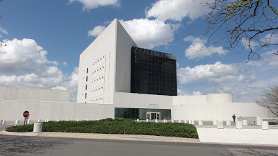
 Architect I.M. Pei's clashing contrasts of curve and line, flat plane
and sinuous chiaroscuro, white solid (concrete) and dark void (tinted
glass) make the Eisenhower Center's faceless uniformity look passé, just as Kennedy's futuristic initiatives (Alliance
for Progress, Food for Peace, New Frontier, Peace Corps, Physical
Fitness Program) made Ike's moderate conservatism a distant memory. Furthermore, the incompatibility of the Kennedy Library's explosive
polygon and the Eisenhower Center's stationary boxes jarringly contrasts
JFK's dynamic impulse for progress ("It's time to get this country
moving again") with Ike's static maintenance of the status quo ("I think that people want peace so much that one of these days government had better get out of their way and let them have it").
Architect I.M. Pei's clashing contrasts of curve and line, flat plane
and sinuous chiaroscuro, white solid (concrete) and dark void (tinted
glass) make the Eisenhower Center's faceless uniformity look passé, just as Kennedy's futuristic initiatives (Alliance
for Progress, Food for Peace, New Frontier, Peace Corps, Physical
Fitness Program) made Ike's moderate conservatism a distant memory. Furthermore, the incompatibility of the Kennedy Library's explosive
polygon and the Eisenhower Center's stationary boxes jarringly contrasts
JFK's dynamic impulse for progress ("It's time to get this country
moving again") with Ike's static maintenance of the status quo ("I think that people want peace so much that one of these days government had better get out of their way and let them have it").In this way the JFK Library's every-which-way erraticism also alludes to Kennedy's reckless, inept foreign policy, from the botched Bay of Pigs invasion to the senseless start of the Vietnam War, as opposed to the keeper-of-the-peace image Eisenhower was after ("Beware of the military industrial complex"), expressed by the quietude of his center complex. Yet the JFK library's juxtaposition of dark and light, void and solid, window and wall could also symbolize the mitigation and reconciliation of Soviet-American tensions with which Kennedy cooled the Cuban Missile Crisis through "never fearing to negotiate" (true to his inaugural speech) and owning up to his Bay of Pigs blunder. The civil rights movements brewing in his time, too, are nobly noted here in the union of black and white on the outside.
Inside, it's a different story. When we step into the main pavilion, the dark of the glass gives way to the light of the sun, the loft of the clouds, the blue of the sea and sky, and the green of the grass. This outside-the-box effect evokes the bright, shining future attained through social, environmental and scientific advancement and enlightenment Kennedy and his followers hoped for through faith in science and technology as prime movers — much as how Paul the Apostle put it in his First Epistle to the Corinthians in the Holy Bible's New Testament:
For now we see through a glass, darkly, but then face to face: now I know in part; but then shall I know even as also I am known. And now abideth faith, hope, charity, these three; but the greatest of these is charity. — I Corinthians 13:12-13The tensile web of steel tubing does denote technology's power to accomplish great things, from putting a man on the moon to our present- day cyberspace ventures. Technology's progression of architecture itself is articulated by the concave curve stack — a slight stealing from the spiral ramp of Frank Lloyd Wright's Guggenheim Museum in New York.
 |
| Photo courtesy of the National Archives |
 |
| Photo courtesy of the National Archives |
 |
| Photo courtesy of the National Archives |
 |
| Photo courtesy of the National Archives |
 |
| Photo courtesy of the National Archives |
Joyless Johnson
For details, see Part IV of this post, soon to come...


